As promised I am continuing my house tour of Number One Grafton St. It's a big post, it's a big project... be prepared :) I was on site twice this week including this afternoon. We are still working on placing furniture and artwork and waiting for the final pieces of furniture, bedding and accessories. There are alot of decisions on what piece looks and goes in what room best. Things have been moved in and moved out and moved somewhere else and then moved again. We all have good strong arms, thankfully. Who needs the gym, right?
Today I'm going to take you on a tour of a Suite 1 and let you join me in the construction and renovation process. The logical place to start would be Suite 1 and a shot of the pre-renovation room.
Suite 1. It was pale purple and as much as some people I know like this colour (KJ) it didn't fit with our vision. In fact, this room was a one room efficiency apartment. The little kitchette and entry were located through that open door on the right with the bathroom on the right hand side of the room. Many century homes became chopped up into apartments during the 60's and 70's and this was one of them. This home had 3 rented units contained under its roof prior to my clients purchasing it.
At this point the room has been freshly painted...sorry my image is dark. I'm going to spare you the pictures when this room became a warehouse and storage space for months during the renovation.
The drapes are up and the furniture is moving in. However, today we decided to swap the cream loveseat with a larger cream sofa from one of the upstairs suites, after this picture was taken. Next up close up of the colour scheme. We're working with red, yellow and creams in this room.
The gorgeous drapery fabic under which each window has cream striped roller shade for daytime privacy.
The bedskirt fabric. These are still being sewn as I write this blog post. In fact all of the bedskirts are at our seamstresses being readied along with a couple more custom toss cushions for the sofa.
This is the far wall and the former doorway that led to the kitchette and beyond that an entry point to the unit.
The door is now sealed up and this is the perfect spot for a headboard wall. The antique wardrobe is stunning and the perfect scale for this room with its 11 ft ceilings. Now where is that headboard?
Ahh .... here it is sitting on the floor and almost camouflaged by the floor. In fact, this is next on the "to do" list. For all you DIY'ers, this is a great project. Take a solid wood panel door. They come in an 80" length, cut 4" off the floor end and it will be perfectly symetrical and ideal for a hotel style king size wall mounted headboard. On further posts you will notice we're using this technique in all of the suites.
One more look through that door that we closed up....
Here is the tired and dated kitchenette that was located through that doorway and tucked into a little closet. This entire kitchen was ripped out, good riddance. The door to the old apartment (on the right you cant see it) is now sealed and drywalled. This is the office from my last post and open to the entry/foyer! Let me show you what it looks like now from the same angle.
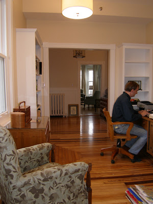
This is exactly the same view with the kitchette gone. It is now the office leading into the foyer which I showed in my last post. And that is Graeme working away on his computer.
The door that is now closed up would have been directly in front of him. Look closely at the pattern on the hardwood floor, it's consistant right through to the foyer/entry. In the original home this area was open to the foyer until at some point they chopped the place up into apartments and put in the kitchette. So right now it's back to the way the builder built it last century.
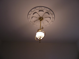
Today I took a couple more pictures of the foyer with the light fixture I missed on my last post. This is the view from the office now.
OK... I have to show you the foyer light fixture that was here pre-renovation and until the new light fixture was installed. Which much to my amazement and my clients many people commented how nice it was. We loved the ceiling medallion, it's fab, but call us crazy ... we thought we could do better for a light worthy of this house. And we did!
Now that's a light fixture fitting of a century home! On to more of Suite 1, sorry I got off track. Lets go back through the old door and look again at the pre-renovation room.
This is the old view and let me put this into perspective with another photo. We had one big room with a door to the kitchette and the former entry area to the effeciency apartment on one side of the room. And another door across the room to the washroom.
Just to the left of the fireplace is where the new doorway to the suite installed.
Same view looking toward the fireplace and washroom door with another beautiful light fixture up there too!
And now this is the view when you enter into Suite 1 beside the fireplace. Like I said alot of walls were torn down or opened up and I haven't even taken you to the second floor yet !!!
The original bathroom from Suite 1. This room was odd. The original shower/tub combo on the right side of this shot had an outside window centered on the tub and believe me it was not in good condition. This space had to be completely redesigned and rebuilt.
And this is how it looks now... the jetted soaking tub is front and center and has replaced the pedestal sink.
Looking to the left the new stand up shower is now in the place of the old linen closet. The same look was carried throughout this house in all of the washroom for a consistant clean look. Chrome fixtures, white jetted tubs with front panel detail and showers tiled in white subways tiles.
This beautiful piece of original artwork is still to be hung and centered over the soaking tub.
I had to finish my post with the state of the art televisions... these 2 pieces of cardboard represent the 2 different sizes of flat screen tv's. How will you ever know which size tv to use in which suite? By using cardboard templates of course! Totally Graeme and Judy's idea and totally brilliant.
I have just one last image to share with you. This adorable seal was photographed by Graeme earlier this spring catching some rays on an ice floe at Panmure Island, PEI.
More suites to follow up on in my next posts.... 2,3,4, & 5.
Thanks for reading. Have a great weekend!
Susan
Over


1 comment:
Oh, I am in love with the seal! I love the panels on the bath too and the height of the curtains is beautiful. Have a lovely Sunday..Rxx
Post a Comment