Happy Friday July 11!
Today is the first year anniversary of opening Moving Designz Home & Cottage. Yes, we opened exactly one year ago today. And what a great year it has been. The store is doing fantastic and our reputation is growing with clients coming from all areas of PEI and the mainland to shop for their homes. I sincerely thank all of you who continue to show support for my little shop and let us come into your homes to design, decorate and furnish your spaces with style. Especially the regulars, and you know who you are, who come back and back and back for more. I truly do appreciate your business and enthusiasm for what we are trying to do here in this small little market.
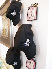
Today I am inspired to show a few pictures I took leading up to opening day. I am also going to show the pretty cottage property I have just completed. If you read last weeks post, I am posting the after pictures of the master bedroom which has undergone a dramatic change.
This was the street view at the corner of Queen and Water leading up to opening day. It surprises me that this choice retail space went unoccupied for nearly 2 years. Luckily for us.
As shown, we had a little banner announcing our arrival which was soon to be replaced by our awning signage.
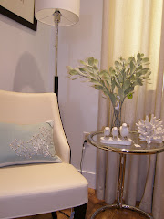
I thought I would show a couple images of images of the interior before we did the massive renovations on the interior space. Shown here we're looking toward the entry ( with the arched window) which was once a window and is now a beautiful pair of double glass doors.
This was how the room looked just to the left when you entered. My sister was horrified when I sent her these pictures of the space I was about to lease ...lol. We had all the plaster removed and chipped away to reveal the original brick walls. Which we then had painted Benjamin Moore Cloud White, much to our landlords chagrin. He liked the original red brick (it's a man thing) but really it had to go and FAST. Once he saw the brick painted white he quickly changed his mind on painting brick. It absolutely changed the feel of the interior.
I will be working on a before and after blog post showing the entire space and scope of the project in the near future. Stay tuned.
Now onto today's post. This house needed an exterior face lift. My clients contacted me through email from another province asking if I could come up with some colours to enhance their newly purchased home. Once the exterior was done we moved on to renovating the master bedroom to give them the authentic PEI coastal look they were after.

Communicating via email (we do this a lot) I took some photos, and then chose soft colours to enhance the many unique and original features of the farmhouse style cottage.

This image shows the house with a fresh coat of primer and new decking. I call this the ugly duckling stage.

The finished house done in a soft yellow with trim accents of chocolate and a deep bluey green. Benjamin Moore Philadelphia Cream for the body, and Benjamin Moore Night Train for accents.

Here I am showing a side view of the house while freshly primed.

A close up angle showing how pretty the house and deck look with fresh new colours.

Above is the master bedroom the first time I saw it. After much planning we decided to take down the wall behind the massive king size bed to open up the room. Behind this wall was a walk in closet with left the room with a very limited layout. The vision was to completely reinvent the room and give it a real coastal seaside feel.

This image was taken during the construction phase. Note the unpainted floor section with the bare wood line just to the left on the floor. That is where the dividing wall for the closet once stood and where the king size bed was originally pinned up against. It was not a supporting wall so by removing it we could really open up the room and reposition the king size bed to give it stunning views to the ocean. This also allowed us to make the bed the focal point of the room.

The finished room in a wide angled shot. Painting the room blue made the space feel cool and inviting, perfect to relax in after a day on the beach! The room has new beadboard trim painted Cloud White, linen textured wallpaper painted a cheerful blue to match the fresh new bed linens, new floor paint, new windows, new white wood blinds, a new area rug, new accessories and new creamy white coloured furniture. New, new, new... I knew it could be wonderful.

Looking just to the left of the bed where the closet once stood shows just how much space we created by removing the wall.

This was the original closet which lead to the master bathroom. Too much wasted square footage.

A close up of the king size bed. Look to the next image to see how we recreated the same bed and wall sconce lighting with a little spray paint.

Same bed, same light sconces updated with white spray paint. A very inexpensive fix to dated shiny brass. And if you look real closely at the window you can just make out the red sand bars of the Northumberland Strait. The bedding is "Douceur Collection" from Moving Designz. Perfect for that light airy cottage look.

The original chair, dresser and area rug.

The same angle and a completely new look. The armoire to replace the closet is from Moving Designz and features storage drawers, as well as, hanging storage inside.

And finally this is the sitting area outside overlooking the beautiful PEI shoreline and beaches. This lovely home is a seasonal rental property to inquire on renting please see this website.
http://www.vrbo.com/114310Sometimes even I am amazed at the diffence of a little paint and finishing touches. By the way I love my job!!!
Thanks for reading. Have a great weekend!
Susan


 A.S. - This is one for you to think about! Send me your comment if you love it...


