
As promised, for todays post I am taking you on a house tour of our latest project. We wrapped up this project on Friday.
The house itself is a 4 bedroom 2 story house situated in a park like setting here in Summerside. When we first visited the house the previous owners were still in residence and at that time we took our initial pictures and dimensions for all the rooms.
Our clients, who were an absolute pleasure to work with, supplied us with magazine pictures of rooms they liked. From there we developed a look which we felt would give them a sophisticated comfortable living space to enjoy with their family and friends. I've had pretty positive feedback from them... they love it!
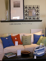
This is the homes livingroom, it's located just to the left after you enter the front door.
Our colour scheme for the main floor of the house is mainly neutrals mixed with pale blues, creams, white, green and hits of dramatic red.


Let's look at the completed familyroom...
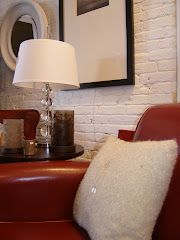
 The family room. I absolutely love this area rug! It was the perfect choice to set off the patterns and colours on the main furniture especially good with the chairs. We got really lucky when we found this gem.

Next up the diningroom...
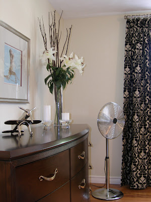
 I wish the pictures came out clearer when I uploaded them. The colours seem very washed out unfortunately. The drapes are beautiful silk panels and there is no way this image does them justice. They are shimmering shades of pale cream, green and pale blue with a lovely red stripe.

I wish the pictures came out clearer when I uploaded them. The colours seem very washed out unfortunately. The drapes are beautiful silk panels and there is no way this image does them justice. They are shimmering shades of pale cream, green and pale blue with a lovely red stripe. On to the breakfast nook...


The kitchen ...


Initially the homeowners wanted to redo the kitchen entirely. But decided since the layout was perfect to give the room a facelift instead with new painted cabinets, hardware, lighting, and granite countertops.


On to the guestrooms...

The twin guest room. I love this great little room. We chose to wallpaper the headboard wall in a very pretty leafy print. Originally I chose this paper for another project but that client changed their mind which worked out for us to use this favorite paper on this project.


The twin guest room. I love this great little room. We chose to wallpaper the headboard wall in a very pretty leafy print. Originally I chose this paper for another project but that client changed their mind which worked out for us to use this favorite paper on this project.

The queen guestroom.


The window bench seating in the queen room.
The double guest room.


We accessorized this dresser very minimally. I simply adore this vase! It was hard to part with but suits the double guest rooms colour scheme perfectly.
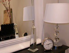
The master suite. Our inspiration here was to give this room a boutique hotel style feel.


 Suite dreams...


 Suite dreams...
I have to thank Anita very much for all of her hard work helping me pull this house together, along with Ashley who assisted us with ordering all of the furnishings, helping on deliveries and manning the store while we spent hours dressing the house.
I'm off to the CGTA show in Toronto this weekend to buy more lovely things for the store, Moving Designz Home & Cottage. I can't wait to see what the show will have in store for us this year.
Thanks for reading. Have a great week!
Susan


 The breakfast seating area.
 An update from last weeks master bedroom photo. The capiz chandelier is now hung and looks simply perfect. What's missing? The upholstered headboard ... it finally came in late last week but it won't be delivered until tomorrow. This is going to be a busy week for us. Our homeowners are due to arrive back on Friday.
 Another view looking toward the desk area.
 This is one of the guest rooms. Almost done here just some artwork to hang and some accessoring. We're still working on completing the queen guest room and the twin guest room so I decided not to post any pictures today.


 A close up of the Barcelona cocktail table perfectly accessorized with fresh pink tulips and pretty accessories.


 Fresh for spring are these colourful serving trays. Also new coastal inspired cottage or wedding guest books.


 Thanks for reading. Have a great week!


